NPG recently launched a new iPad app Nature Journals – an app that allows us to distribute journal content to iPad users. I thought it might be interesting to highlight a few of the design decisions we took and discuss why we took them.
Most publishers when they make an iPad magazine tend to design a skeuomorphic digital facsimile of their printed magazine – they build in lots of interactive features but build it using similar production processes as for print and make it feel like a print magazine. They layout each page (actually they need to layout each page twice one for landscape and one for portrait view) and then produce a big file to be distributed via Apple’s app store.
This approach feels very wrong to me. For starters it doesn’t scale well – every issue needs a bunch of people to layout and produce it; from an end users point of view they get a very big file and I’ve seen nothing to convince me most people want all the extra stuff; and from an engineering point of view the lack of separation of concerns worries me. I just think most iPad Magazines are doing it wrong.
Now to be clear I’m not for a moment suggesting that what we’ve built is perfect – I know its not – but I think, I hope we’re on the right track.
So what did we do?
Our overarching focus was to create a clean, uncluttered user experience. We didn’t want to replicate print nor replicate the Website instead we wanted to take a path that focused on the content at the expense of ‘features’ while giving the reader the essence of the printed journals.
This meant we wanted decent typography, enough branding to connect the user to the journal but no more and the features we did build had to be justified in terms of benefits to a scientist’s understanding of the article. And even then we pushed most of the functionality away from the forefront of the interface so that the reader hopefully isn’t too aware of the app. The best app after all is no app.
In my experience most publishers tend to go the other way (although there are notable exceptions) – most iPad Magazines have a lot of app and a lot of bells and whistles, so many features in fact that many magazines need an instruction manual to help you navigate them! That can’t be right.
As Craig Mod put it – many publishers build a Homer.
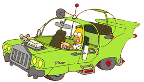
When Homer Simpson was asked to design his ideal car, he made The Homer. Given free reign, Homer’s process was additive. He added three horns and a special sound-proof bubble for the children. He layered more atop everything cars had been. More horns, more cup holders.
We didn’t want to build a Homer! We tried to only include features where they really benefit the reader or their community. For example, we built a figure viewer which lets the reader see the figures within the article at any point and tap through to higher resolution images because that’s useful.
You can also bookmark or share an article, download the PDF but these are only there if you need them. The normal reading behaviour assumes you don’t need this stuff and so they are hidden away (until you tap the screen to pull then into focus).
Back to the content…
It’s hard to build good automated pagination unless the content is very simple and homogenous. Beautiful, fast pagination for most content is simply too hard unless you build each page by hand. Nasty, poorly designed and implemented pagination doesn’t help anyone. We therefore decided to go with scrolling within an article and pagination between articles.
Under the hood we wanted to build a system that would scale, could be automated and ensured separation of concerns.
On the server we therefore render EPUB files from the raw XML documents in MarkLogic and bundle those files along with all the images and other assets into a zip file and serve them to the iPad app.
From the readers point of view this means they can download whole issues for offline reading and the total package is quite small – an issue of Nature is c. 30MB, the Review Journals can be as small as 5MB by way of comparison Wired is c. 250MB.
From our point of view the entire production is automated – we don’t need to have people laying out every page or issue. This also means that as we improve the layout so we can rollout those improvements to all the articles – both new content and the archive (although users would need to re download the content).
